MolarOS, AI-powered Dental SaaS · Design System
Building a consistent design system for an AI-powered dental SaaS
An AI-powered dental SaaS supporting dentists throughout their clinical workflow — from clinical findings to diagnosis and treatment planning.
- My Role
- Sole Product Designer — UX/UI + Design System
- Duration
- 3 Months, ongoing
- Team
- Product Lead, PM, Product Designer (Solo), Engineers (cross-functional)
- 91
- reusable componentsNew screens ship without rebuilding UI
- 72
- Storybook storiesDesign and code stay aligned
- 1
- token-based systemFrom Figma variables to the code library
Rapid AI-driven expansion, broken consistency
With no shared standard, non-designers built the same feature differently each time — until product-wide consistency broke down.
MolarOS grows quickly. Product and engineering generate new screens with AI, often without a designer involved, and features are added faster than anyone can review them.
Each screen worked on its own. Together they drifted: the same action looked different from one page to the next, and every page arranged its information in its own way.
From design standards to code components
A design system linking design tokens to Storybook — resolving UI inconsistency in a fast, AI-driven build environment.
Audit workflows
Review key screens and user flows
Figma
Define standards
Create design tokens and variables
Design Tokens · Variables
Build components
Create reusable UI components
Components
Sync with code
Document in Storybook
Storybook · Code
Redesigning the core clinical workflow
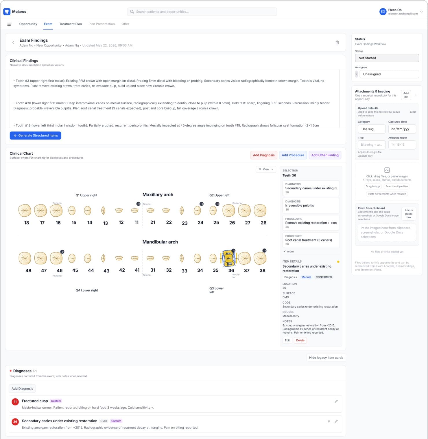
Restructured the IA and tightened content width for faster clinical scanning.
The work started with the screens themselves. On Exam Findings, wide content blocks and separated sections made the page slow to scan, so I narrowed the content and connected the sections into one flow: clinical findings, then the chart, then the diagnosis.
Foundational design tokens
Abstracted primitives into semantic tokens to separate intent from raw values, then linked them through Variables for consistency across components.
Every visual decision starts as a primitive: a raw color, a spacing step, a radius. Semantic tokens sit on top and name the intent — primary, border, muted — so components point at meaning instead of raw values. Both layers live as Figma Variables and carry the same names into code.
Primitives from the production token file — hover a swatch for its value.
slate
50
slate/50 · #f8fafc100
slate/100 · #f1f5f9200
slate/200 · #e2e8f0300
slate/300 · #cbd5e1400
slate/400 · #94a3b8500
slate/500 · #64748b600
slate/600 · #475569700
slate/700 · #334155800
slate/800 · #1e293b900
slate/900 · #0f172a950
slate/950 · #020617blue
50
blue/50 · #eff6ff100
blue/100 · #dbeafe200
blue/200 · #bfdbfe300
blue/300 · #93c5fd400
blue/400 · #60a5fa500
blue/500 · #3b82f6600
blue/600 · #155dfc700
blue/700 · #1d4ed8800
blue/800 · #1e40af900
blue/900 · #1e3a8arose
50
rose/50 · #fff1f2100
rose/100 · #ffe4e6500
rose/500 · #f43f5e600
rose/600 · #e11d48700
rose/700 · #be123corange
50
orange/50 · #fff7ed100
orange/100 · #ffedd5400
orange/400 · #fb923c500
orange/500 · #f97316600
orange/600 · #ea580cjade
50
jade/50 · #e6f8f0100
jade/100 · #c2efdc500
jade/500 · #0ea371600
jade/600 · #0a7f5cyellow
50
yellow/50 · #fefce8100
yellow/100 · #fef9c3400
yellow/400 · #facc15500
yellow/500 · #eab308Spacing
Radius
Rule — controls: 8 · containers (cards/alerts): 12 · pills: full
Components standardized with tokens
Standardized recurring UI — buttons, inputs, icons — by variant, size, and state on the token layer, keeping patterns consistent across screens.
Each component is defined once per variant, size, and state, with every value bound to a token. The buttons below are rebuilt from the production spec, so the states can be tried rather than read off a screenshot.
Live components — hover, focus, and press them.
Primary
Main action
Secondary
Supporting
Outline
Neutral
Ghost
Low emphasis
Destructive
Irreversible
AI
AI-generated only
Connecting design components to a code library
Documented components in Storybook so design and engineering share one source of truth.
Every component is documented in Storybook next to its code. A designer checking a variant and an engineer implementing it are looking at the same thing.
One system across the clinical workflow
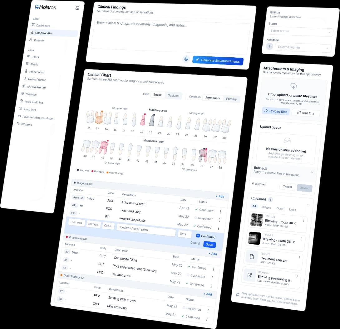
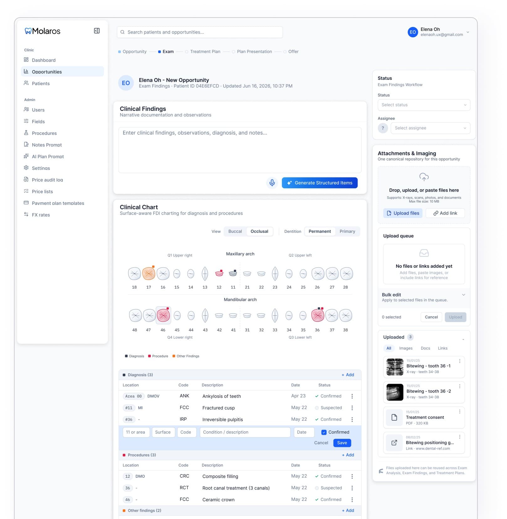
Applied the same components and design patterns across key workflows, from Exams and Treatment Plans to Attachments and Status management.
A consistent workflow with AI-assisted data entry
Shared components and interaction patterns keep the workflow consistent, while AI reduces manual clinical data entry.
- ✓Shared components & patterns
- ✓AI-assisted data entry
- ✓Reviewable AI output
Complex treatment plans, structured at every level
Organized treatment plans into groups and items, with optional information like Notes, Price, and Findings.
- ✓Hierarchical structure
- ✓Optional information
- ✓Consistent interactions
A system that connects design and code
Consistent UI patterns across the core product
91 reusable components let new screens ship without rebuilding UI
Token-based system makes the product easier to maintain & scale
72 Storybook stories keep design and code aligned