Autonomous Vehicle HMI · Research-based UX Design
Autonomous Vehicle UX/UI for Senior Drivers
Redesigned information priorities and HUD structure so senior drivers can process complex driving information quickly and accurately.
- Collaborator
- Hyundai Motor Company
- My Role
- UX/UI Design · IA · UX Research
- Duration
- 12 Months
- Team
- PM · UX/UI Designer (solo) · Researcher · Data Analyst
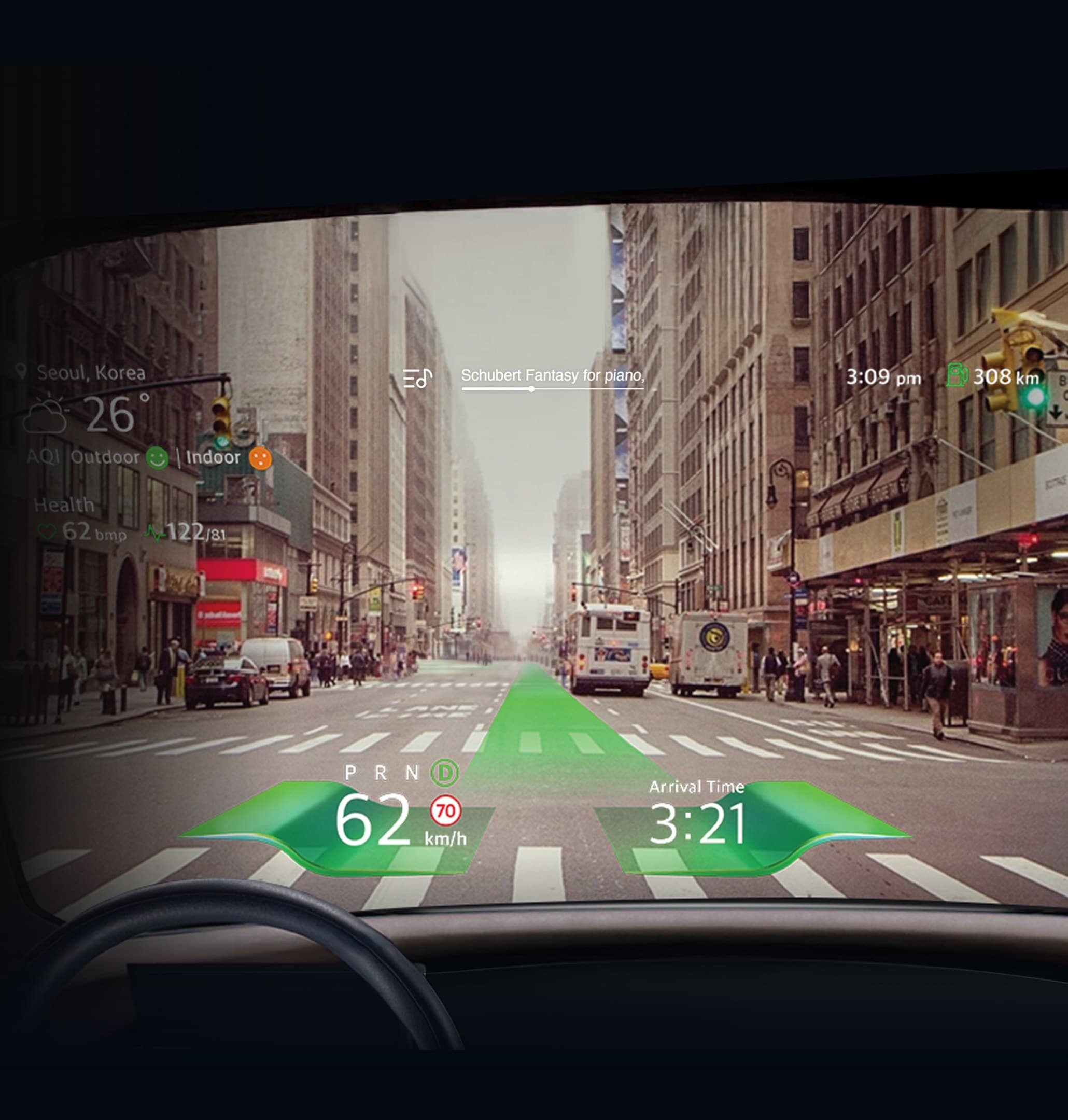
- 97%
- Driving info recognition rateFast reactions to speed, distance, alerts
- +36%
- Easier information recognitionFewer eye movements, faster processing
- 4.03/5.00
- User satisfactionTop scores for readability and clarity
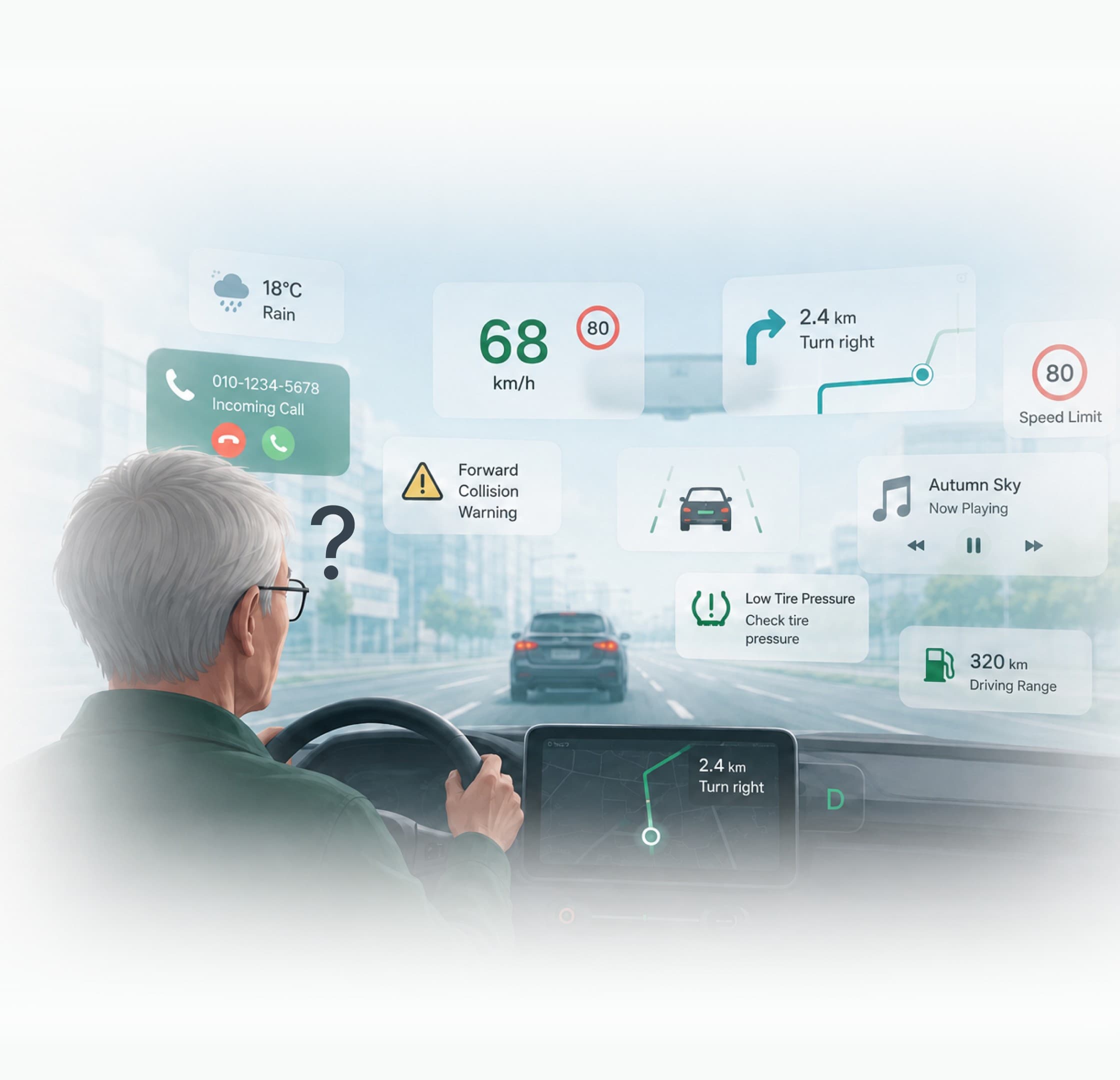
Cognitive overload from complex driving information
Desk research and interviews with senior drivers showed that the more information appears at once, the higher the cognitive load — and the harder it is to follow the vehicle's decisions.
Key challenges for senior drivers
- ✓Information overload
- ✓Difficulty identifying key information
- ✓High decision-making load
From research to design principles
Turned research insights into HUD design principles.
Discover
Identified causes of cognitive load via interviews, simulator, and eye tracking
Define
Classified information as core or secondary and defined placement principles
Develop
Applied the principles to HUD designs and scenarios
How senior drivers perceive driving information
Three research methods revealed how senior drivers process driving information.
I ran three studies with senior drivers: interviews (n=34), a driving simulator test (n=30), and eye tracking (n=30). Each pointed the same way — the more the interface showed, the slower and less certain the drivers became.
Information overload slows processing
Delayed reactions under complex UIs
More information, more confusion
Frequent gaze shifts to locate information
Attention stayed forward
Secondary information was rarely viewed
Research-driven information priorities
Based on interview results, separated essential from secondary information and prioritized what to display on screen.
Interviewees named what they need while driving. Driving info, following distance, lane departure, health status, and pedestrian alerts led the list; weather and texts or calls barely registered. That split became two placement principles.
Information needed while driving
(multiple responses, n=34, ages 55+)
Essential
(core info)
- Driving info18
- Following distance18
- Lane departure17
- Health status17
- Pedestrian alerts15
- Route guidance6
Secondary
(lifestyle, media)
- Speed bumps5
- Weather, fine dust1
- Texts, calls1
Design Principles
- 1. Core info at center of view
- 2. Secondary info at the edges
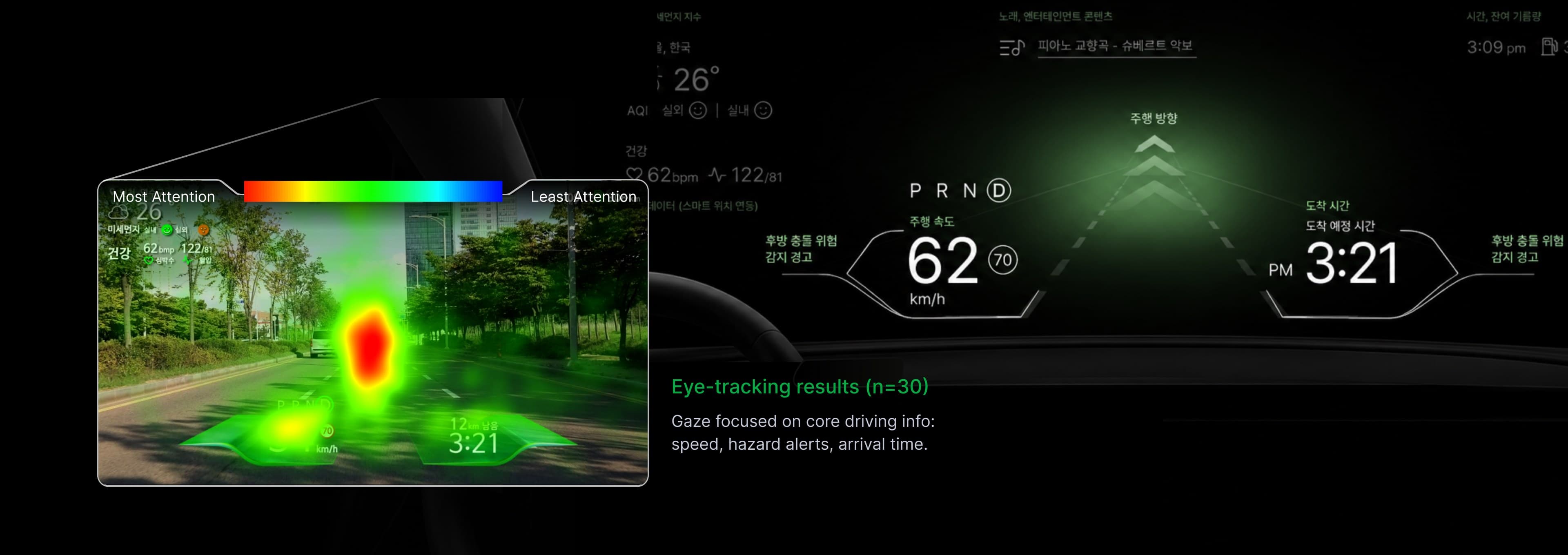
Gaze patterns centered on core info
Eye tracking mirrored the interviews: drivers looked at core information first — speed, hazard alerts, arrival time — and paid far less attention to weather, media, and health info.
Default driving screen layout
Based on the research, core information sits in the driver's central view, while secondary information moves to the periphery.
Situation-based HUD screens
The HUD (head-up display) shows only what each situation requires — normal driving, hazard events, and lane departure.
The default layout is only the starting point. As the situation changes, the HUD changes with it: it keeps core information during normal driving, brings hazard warnings to the front when something is ahead, and emphasizes lane information when the car drifts.
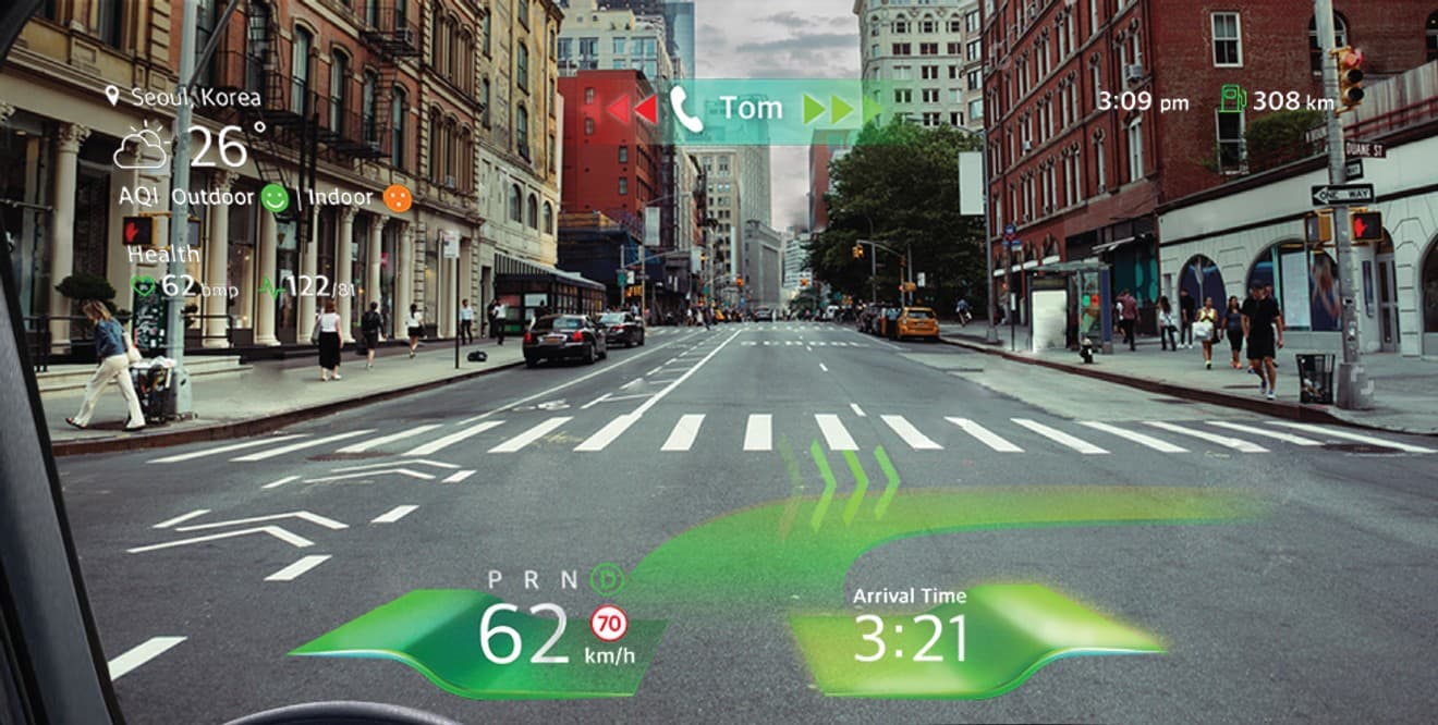
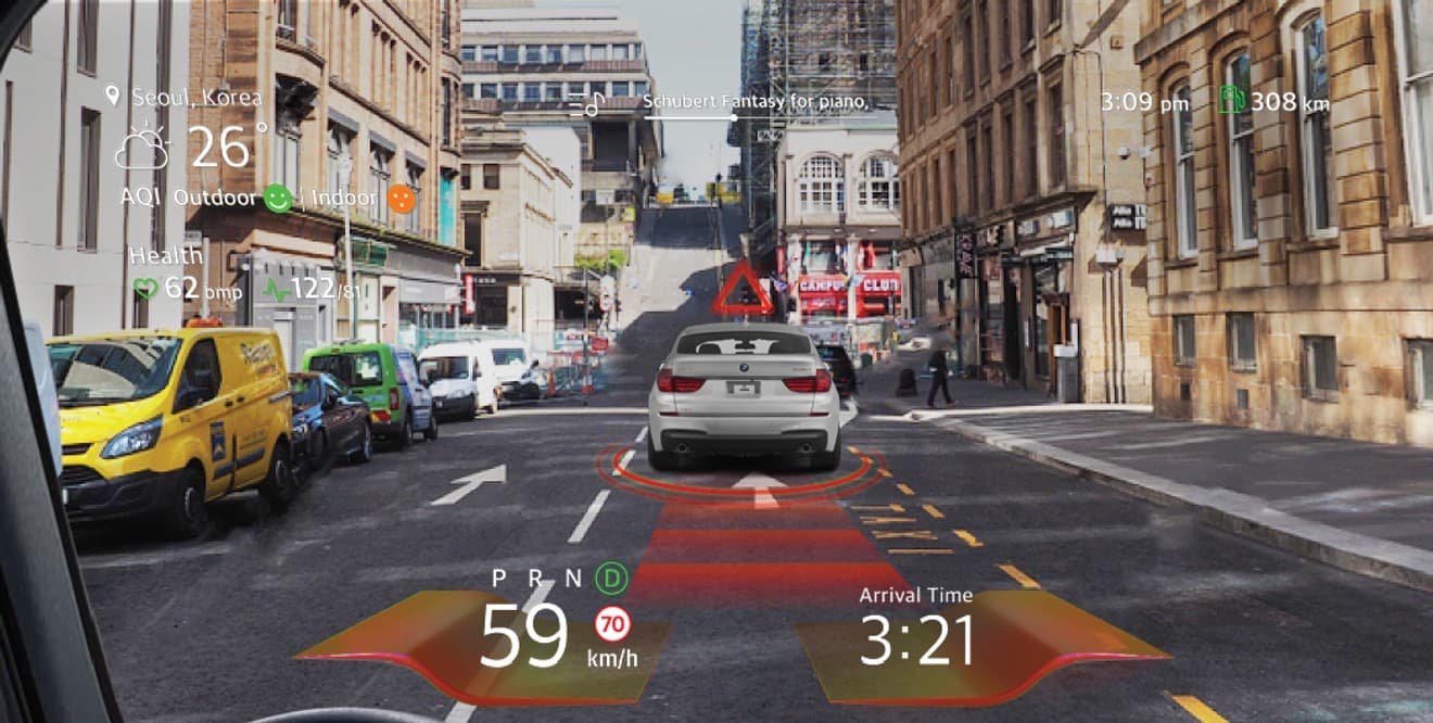
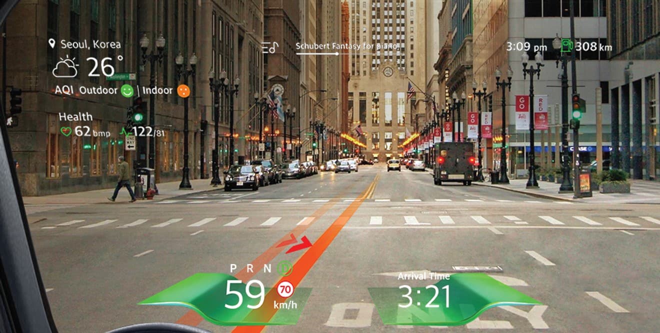
Normal driving — Core info kept + call alerts minimized
Higher comprehension and user satisfaction
Research-driven information prioritization improved recognition and user satisfaction.
Driving info recognition rate
Fast reactions to speed, distance, alerts
Easier information recognition
Fewer eye movements, faster processing
User satisfaction
Top scores for readability and clarity